Lean on Pete production designer Ryan Warren Smith discusses how he created rich, detailed environments that subtly reveal character. This is the third feature in our Special Issue on Lean on Pete.
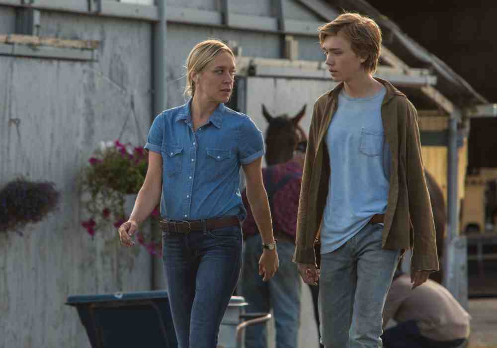
Lean on Pete is not a film with sets that scream for attention — but as the story of 15-year-old Charley’s (Charlie Plummer) search for home, the environments he inhabits are vital. Production designer Ryan Warren Smith creates spaces that allow Charley a certain degree of comfort, while never letting him settle completely. As he traverses the American landscape, meeting various people who offer him temporary support but can’t be the permanent parental figure he yearns for, we feel Charley’s despair in the drabness of his surroundings. But there’s just enough vibrancy for us to share his glimmer of hope, too.
I talked to Smith about designing spaces that reflect where Charley is in his journey, designing colour schemes that reveal and enrich character, and using director Andrew Haigh’s thoroughly mapped out blocking as a roadmap for location scouting.
Seventh Row (7R): How did you come on board the project?
Ryan Warren Smith: I worked on another Willy Vlautin adaptation called The Motel Life. I became friends with him, so I knew that this project was happening. I just loved the book. It’s one of my top five favourite books. I really, really wanted to work on it. When Andrew was coming to research the film in Portland, Willy invited us both over for dinner. We enjoyed each others’ company — and then I didn’t hear about it for another four years.
Typically, I get a script, and it’s something I’m not familiar with. With this one, I knew the material so well and knew the writer so well and had had many long, drunken conversations with him about the story and characters. I had a lot of insight going in.
7R: What initial conversations did you have with Andrew?
Ryan Warren Smith: What I typically do, and did on this one, is come up with a visual look book of key locations and overall tones and colours for the film. I went around to the real places that are in the book, took photographs of my own, and sent that along. Before I [talked with] Andrew officially, I put that together and got that to him so he could see where I was coming from.
7R: The colours are quite muted and earthy.
Ryan Warren Smith: That’s kind of my overall aesthetic. In stories like this, I feel as if bright colours are a bit distracting. Especially in this world — the underbelly of horse racing — the brightest thing I would want in any of these places would be a neon here or there. Everything else we wanted to be really toned down. We did have colours, but they were faded colours that had lost their lustre over time.
[wcm_nonmember]
To read the rest of the article, purchase our Lean on Pete ebook
Enrich your viewing experience by snagging our ebook on the film.
[/wcm_nonmember]
[wcm_restrict]
7R: Andrew is very particular about blocking. How did that play into your location scouting?
Ryan Warren Smith: Andrew is very particular in how things are laid out in his head because he wrote them down, which I love. We would speak about that beforehand. Then, we did all the director scouting, where it’s all of us in a van, looking at places, getting a feeling, before the chaos hits. What’s so great about that is you not only find out what does work, but you also find out what doesn’t work.
A lot of those conversations were had then: where blocking should be, where windows should be, that kind of thing. Then, I was able to take that knowledge from those earlier scouts, continue on my own, and make sure that the locations worked for those scenes.
7R: What were the reasons why a location wouldn’t work?
Ryan Warren Smith: We always wanted Portland Meadows, which is where this was written for. At the beginning, we weren’t sure if we were going to be able to get it. There were a lot of hoops we had to jump through. So we saw a few different horse tracks that were too updated, or too modern.
For Charley’s house, we had to base it around the scene where Ray is thrown through the window. We had to make sure that the blocking worked for that more than anything else. I knew exactly what they would want and how they would shoot it. Then, I could run with that and find the locations that would work perfectly.
7R: In comparison to previous projects you’ve worked on, how does having to adhere so closely to Andrew’s blocking affect your process?
Ryan Warren Smith: I really enjoyed that. Andrew was very specific about certain things, but he was also very bendable. He’s come from the indie world, like I have, and we’re all coming up and getting to make larger budget movies now.
Coming from that world, you have to be bendable. He was never so particular that it was like certain locations couldn’t work because he couldn’t bend to that. But I loved having that insight, direction, and decisiveness early on, because it saved a lot of time down the road for me to do my work.
7R: When I spoke with DP Magnus Jønck, he talked about simplifying the frame: making sure that everything we see serves a purpose so the look isn’t overcomplicated. Is that also how you approached your set design?
Ryan Warren Smith: It’s the same philosophy as Magnus. We worked a lot together to use practical lighting, to have as little movie gear around as possible. I find that it’s distracting; Magnus and Andrew feel the same way.
We were stripping back and adding our own set dressing pieces, working out what would be around these people and what wouldn’t be around them.
[clickToTweet tweet=”‘I loved having that insight, direction, and decisiveness early on, because it saved a lot of time down the road for me to do my work.'” quote=”‘I loved having that insight, direction, and decisiveness early on, because it saved a lot of time down the road for me to do my work.'”]
7R: How Charley looks in relation to his environment is so important. Did you work with the costume designer, Julie Carnahan, at all?
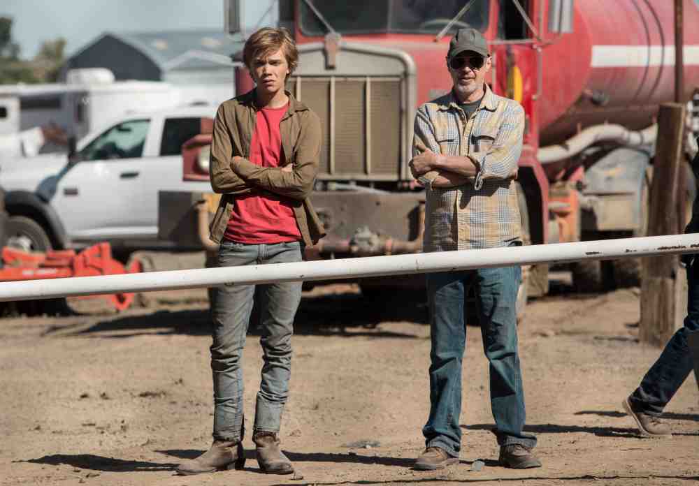
Ryan Warren Smith: We worked on that very closely together. I prefer not to see red in films. I find it distracting. But for Charley, we picked a red shirt, because the environments he was going to be in are washed out, so a really faded red shirt worked really well, especially in the desert environments.
I typically will come up with a colour palette for each character at the beginning: what colours should be around them and what colours shouldn’t be around them? I try to incorporate that into my paint department, and then also costumes, so we can all work together to make sure that the clothes coming into my sets aren’t going to clash. On every project, I try to work with the costume designer really tightly.
7R: Were you mostly just working out a colour palette for Charley, or did you do that for some of the supporting characters, too?
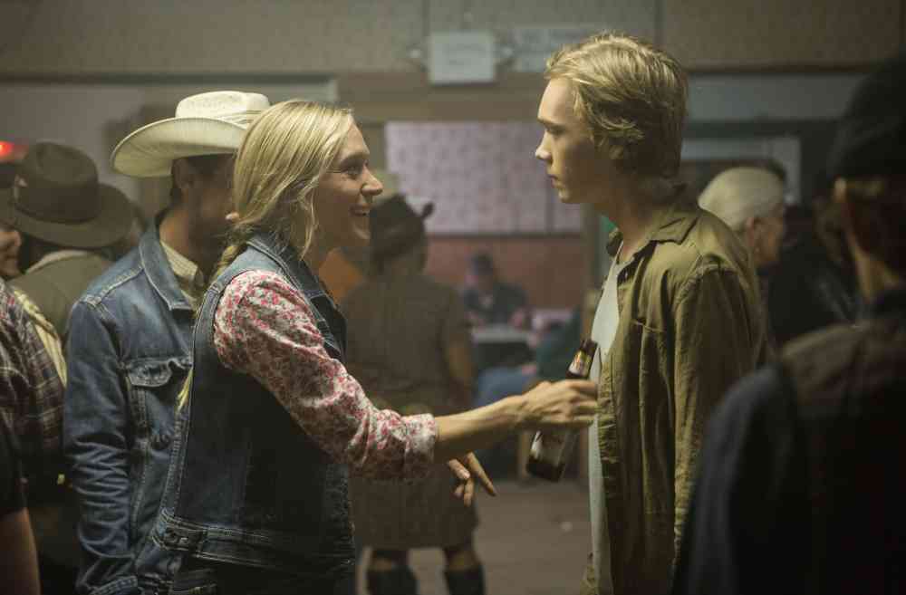
Ryan Warren Smith: It was Charley, but it was Del [(Steve Buscemi)] a lot, too, and Bonnie [(Chloe Sevigny)].
From a really early age, most of my memories are colour-coded. With any specific memory, I could tell you what colour that memory is. It’s something that was just instilled in me from a very early age, and I never really realised it until a few years ago. Now, I can read a script, look at a character, and know what colour that character should be. I try to come across those colours as early as possible, so Magnus, Andrew, Julie, and I can go from there.
It’s tough with something like this because you have a character like Del, who’s not the nicest guy, but he’s also a bit of a father figure to Charley. So you have to play with that, and you have to make him somewhat inviting. We used a lot of brown and tan — and maroons, as well, like his vehicle. We really wanted to have some sense of an inviting maroon colour that’s somewhat comforting to Charley. We used that elsewhere in [Charley’s] house. You cross colours from one place to another to get an overall tone throughout.
We used a little bit more colour for Bonnie. We only see her actual environment once, and it’s her trailer. We added some flowers there and a little bit of colour. When Charley finds his aunt, we used some similar colours. It’s like a feminine touch that you see throughout the film, in those feminine environments.
7R: The film is all about Charley’s quest to find a home. He goes through all these different environments that he might feel somewhat comfortable in, but he’s looking for more stability. How did you approach dressing all the various interiors to reflect how at home he feels in them?
Ryan Warren Smith: With each of those places [where] he stops along the way, you want to give him a glimpse of what it could be to have a home again. All those places needed to feel comfortable and warm, even if the characters weren’t.
The trailer where Steve Zahn’s character lives, there’s a woman there, so there’s a bit of that feminine touch that, subconsciously, is inviting to Charley: that’s what he’s lacking since his mom left. You don’t see it so much in his house with his dad, but you see it there, and you see it a little bit at the soldier’s house that he stops in, only because a woman comes into that environment for the dinner scene.
We thought about that house as [having run in the family, passed down to them by] their grandparents before them. You can have these warm, inviting, family environments without spoon-feeding the audience — allowing them to feel, hopefully, what Charley is feeling in each of these environments.
[clickToTweet tweet=”‘I can read a script, look at a character, and know what colour that character should be.'” quote=”‘I can read a script, look at a character, and know what colour that character should be.'”]
7R: How did you approach dressing the house at the beginning, which Charley has just moved into with Ray (Travis Fimmel), his father?
Ryan Warren Smith: The thought behind that was that this is something that they do quite often. They’re used to it. They keep just what they can carry in Ray’s van. The bed isn’t on a box spring; it’s just on the floor. Charley’s possessions are minimal because he knows that he’s going to have to pack them up again soon. They know that it’s going to be temporary once again.
The only existence that Charley knows is that his dad drifts, and Charley drifts with him. We wanted that to feel like they had just moved in, but they weren’t getting real comfortable either. They both know they’re going to move again soon.
7R: There are a lot of exteriors in the film. I think there’s a notion that, as a production designer, you don’t do any work on the exteriors, which I don’t think is true. What kind of alterations did you make to those environments?
Ryan Warren Smith: I hope to look invisible in all my sets. Exteriors are something that we use a lot of greens for, which means earth materials, dead plants, dead grass, things like that. If something’s looking too green, we’ll brown it down by sprinkling hay, or we’ll put dead plants or trees or branches in front of things that are looking too bright and vibrant.
On the backside of the horse track, there’s a rose bush that’s growing right by Del’s tack room. That’s something that we planted on purpose, to have something blossoming around Charley as he’s starting to go his own route. You’d see it in the background and wouldn’t even think about. It’s those types of little things that we do on an exterior set, which are very subtle and somewhat invisible, but go a long way.
7R: You shot in order. How did that help?
Ryan Warren Smith: It helps a tremendous amount. Shooting out of order, continuity-wise, can be a total nightmare. It’s so much to keep track of. Shooting in order is something I also did on Green Room [(2016)]. You can build those layers as you go, establish them, and keep them going. That’s a huge tool, And it’s very rare that you get to. When I do, I really, really enjoy it. I think most of the departments do.
7R: Charley’s going on a long journey through all these different locations. How did you create a visual cohesion between all the environments he’s travelling through?
Ryan Warren Smith: That is something we looked at a lot with lighting: making that somewhat consistent, with colours, through lighting. Other than that, when Charley does get into that red shirt, it was about allowing that to be the brightest thing in the room and letting everything [else] fade off. That was something that we worked hard on for each location: to just tone things down and allow Charley to be the heart of the room.
[clickToTweet tweet=”‘On each location, we wanted Charley to be the heart of the room.'” quote=”‘On each location, we wanted Charley to be the heart of the room.'”]
7R: People have drawn comparisons between Lean on Pete and the films of Kelly Reichardt — particularly Wendy and Lucy, which you worked on. How did your collaboration with both directors differ?
Ryan Warren Smith: Kelly is a very opinionated, strong-willed collaborator. Andrew has a similar sense of humour to Kelly, but I don’t think he’s as strong-willed as her. So it’s two different worlds. But I can see where they’re almost cut from the same cloth, with what they like and what they gravitate towards. They take their time with scenes, don’t rush, don’t over-cover… it’s from the same school.
To be able to work with numerous people like that is just such an honour and a dream come true. And then, to have your work compared to each other… it’s hard for me to explain how cool and flattering that is. That means that people are picking up on colours and tones without even knowing where they come from, which I love, because like I said, I want to remain invisible.
7R: There are clear similarities between the protagonists of those two films: they’re both quite lonely, inhabiting similar landscapes, and looking for a home. And in both cases, it’s more about how they look in relation to the landscape rather than the landscape itself. Was your approach to creating the look and feel of Wendy’s environment similar to your approach with Charley?
Ryan Warren Smith: With Wendy and Lucy, we wanted to be close to her. You wanted to feel what she was feeling. It was always about making that the focus: being tight with her, seeing what she’s seeing, being in the darkness with her when it’s dark, not over-lighting things, and allowing things to be what they are.
On [Lean on Pete], we did something similar with Charley. We stayed close with him and wanted to feel what he felt. I can’t say that similarity was anything intentional other than that I go on instincts in all my films. All my choices for colours, set dressing, and props are instinctual choices. That’s something I’ve fine-tuned and am able to trust at this point, knowing that it works. It’s got me where I am.
7R: Both Andrew and your frequent collaborator Jeremy Saulnier heavily plan their blocking. But I’ve heard that So Yong Kim, whom you worked with on For Ellen (2012), likes to let actors improvise and just find the scene. How did that approach affect the way you worked and collaborated with her?
Ryan Warren Smith: I like to work in different ways and learn different ways. Working with So Yong Kim was a real pleasure. She’s such a sweet lady, and she’s so cunning and so great. She really does like to let scenes just go, see where they’ll go, and see if they’ll morph into something else.
For Ellen was so small; So and I didn’t have a location manager. We found all the locations ourselves. We were the first two out there. I met her [in person] for the first time when she picked me up at the airport, and we drove to upstate New York together.
Our crew was eight to ten people and my budget was $2,000. For an entire movie, that’s crazy. It was just about going into real environments and choosing them based on what we can do. So and I had to be completely bendable: find the environments that helped tell the story, and then take things away and add things only when necessary. She creates a much more fluid and adaptable environment, which I think comes through in the stories that she tells, as well.
For [So], it is all about the character. I so appreciate that, because with my environments, I really look for the character, as well. I don’t want the environments to feel false to where [the character] would be and what would be around them.
7R: You’re working on TV now for the first time, with the third season of True Detective. TV is obviously much more expansive, with lots of sets that you’re revisiting. How different have you found that process?
Ryan Warren Smith: It’s really night and day. I’m working with Jeremy Saulnier again, which is great. It’s our third project together. Our language is so tight at this point; there’s a shorthand there that’s easy. It’s working with the studio — the corporate entity — and the politics that come with that which is the hard transition.
Also, dealing with so much material. Up to this point, the longest shoot I’ve done is 40 days. On this one, we’re going 140 days, so that is pressed. I’m five months in right now, and I have a three year old girl and an eight month old baby, too, so it’s a tough balance.
But also, I have more money and crew and resources than I’ve ever heard of. In all the other films we’ve mentioned, all my ideas were essentially limited to what I could pull off myself, or with a small crew. There would be a lot of times where I wouldn’t bring up certain ideas because I couldn’t pull them off by myself.
On True Detective, I’m no longer limited to what I can do by myself, or to how much something costs. My ideas are absolutely limitless. That part has been really cool: to be able to control all colours, paint cars, paint buildings, tear down houses that don’t look right. It’s crazy. It’s the kind of stuff I’ve always heard about but have never experienced.
I’m so in the thick of it now, and I’m learning a tremendous amount that I probably won’t even be able to process until I’m done with it. It’s a large step and a large shift that I think I have adapted to well. The sets are looking great and the world that we’re creating is really interesting. The work is really interesting.
Read the rest of our ebook on Lean on Pete here >>
Production design is vital to building character and creating tone. Maggie’s Plan director Rebecca Miller talked to us about utilising slightly surreal sets to capture the tone of a screwball comedy. Crimson Peak also has more exuberant sets, this time to pay homage to gothic horror. Una used more naturalistic sets, but even these worked as a sort of emotional landscape for the two main characters, designed to facilitate and reflect their conflict with one another. [/wcm_restrict]
